Articles
Before and After Data Visualizations
- By AFP Staff
- Published: 6/6/2022

Creating good visuals to communicate quantitative information is part art and part science. With the increased focus on business partnership and communication, “now” is always a great time to ask if your reports are effectively delivering your message in a clear, succinct manner.
Need some inspiration? Check out these before and after charts, submitted by AFP members from their typical variance reporting packages.
We had a lot of fun at our report renovations webinars over the past few months as Dave Paradi and Ron Monteiro provided their rules for finance data visualizations and storytelling, and Nikita Miller and Carmen Turner lent a practitioner’s perspective to the makeovers.The AFP FP&A community submitted reports to our expert panel, including John P Monczewski, Head of Analytics & Reporting at Bolthouse Farms. “The comments on our reporting were spot on, and helped us to recognize that we cannot simply build to a user specification or show something that people are accustomed to seeing. We need to be more advisory on what tells the message and how to we get to the critical decision making.” (Details below the article on how you can submit your reports for consideration.)
Sign up for our next data viz focused webinar, Using Storytelling to Enhance Business Partnering. More data visualization articles can be found here and here. If you are an AFP Member, you can watch the recorded video here. (Pro tip: check out Dave’s complaint about storytelling at 15:50 in the second video).
We've put together several examples of Dave and Ron’s before-and-after report makeovers, with notes about changes. Our hope is that these improvements help illustrate Data Visualization Best Practices and you can take the examples here and apply them to your financial reports. Visual communication of data is a skill we can work to improve!
EXAMPLE 1
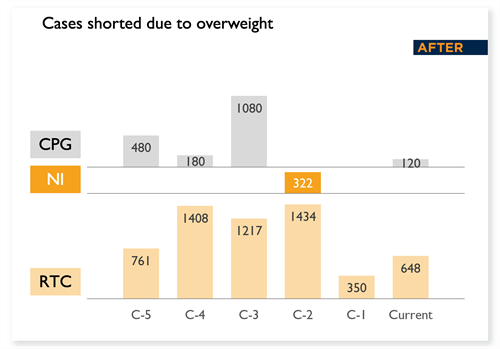
The original stacked chart challenges the reader to compare each of the three categories against themselves because RTC is so dominant. The new look chart creates three views and is more informative about each category.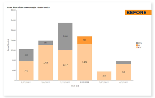
EXAMPLE 2
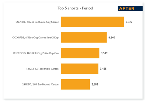
The original view requires the reader to do a lot of work, comparing size of wedges and applying the labels in the legend. The new look chart is easier to read because it rank-orders the periods and includes the labels in a useful location.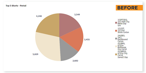
EXAMPLE 3
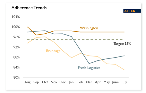
The original chart has a clutter of labels that does not add to the message about trends relative to the target. The new look chart eliminates that to focus on the message.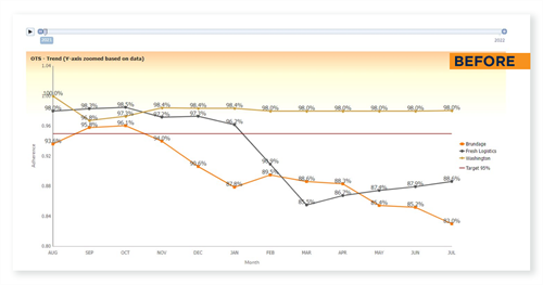
EXAMPLE 4
A common “all in one page” summary of financial performance that only a finance person who has seen this chart for years could love. Can you find the main point here?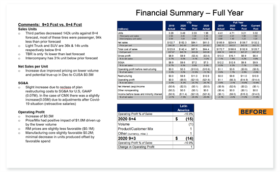
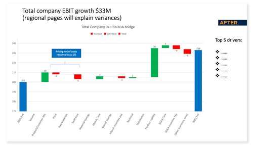
A new look page to summarize the total company position—a waterfall chart is a strong way to show material changes walking from one period forecast to another. Notice that you can pick out the $30m difference immediately!
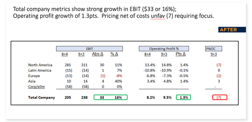
An additional new look page that covers regional changes and has a headline that summarizes the content and implication for action in PNOC, which gets its own column. Note that sometimes, there is no substitution for a good table!
EXAMPLE 5
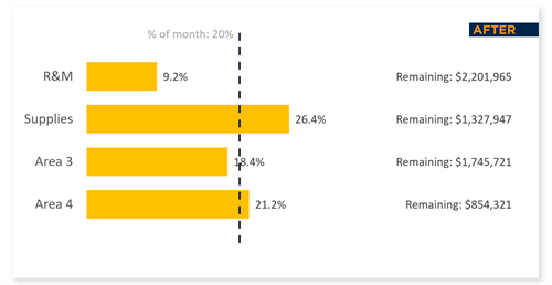
All those cool gauges, where the good is sometimes on the left, sometimes on the right, replaced by one table with a standard reference.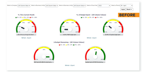
EXAMPLE 6
Do we even need to say anything?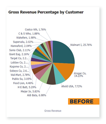
EXAMPLE 7
In this original, does anyone’s neck hurt in trying to read down the side? Everything gets small after Walmart and Kroger.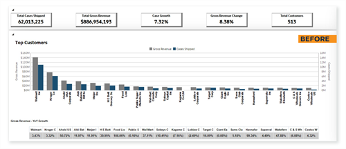
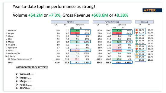
This moves from a visualization to a table and adds familiar red/yellow/green alerts. Notice the focus on just the top ten, and the introduction of Gross Revenue per Unit, an important upgrade from the original!
Do you have reports that could use some tender loving care, and would be a good candidate for report renovations? Send them to Bryan Lapidus at [email protected].
Copyright © 2024 Association for Financial Professionals, Inc.
All rights reserved.

