Articles
Best Practices for Compelling Data Visualizations
- By Bryan Lapidus, FPAC
- Published: 2/22/2022
 Why is data visualization an issue for FP&A in general?
We do not work in FDD, financial dump department, where we throw charts at people and walk away. People in FDD can be automated out of a job and their information is seldom impactful. No, we work in FP&A, analysis is in our name and DNA. We should be presenting insights, and visualizations are effective forms of communication, to elevate our work from good to great.
AFP set out create a webinar series that shows in practical terms what can be created through a reporting renovation, with graph glow-ups and charting conversions. Nikita Miller, FPAC, director of FP&A at the Kresge Foundation and a member of AFP’s FP&A Advisory Council provided the voice of the practitioner, and two finance communications specialists provided before-and-after views of member slides: Ron Monteiro, speaker, facilitator and coach at KICT Inc.; and Dave Paradi, data presentation expert, author and speaker, ThinkOutsidetheSlide.com, brought their expertise to the topic in “Visualization: Review and Critique of Performance Reporting.” Their guidelines for visualization and communications are relevant across all reporting platforms and tools.
Rules for data and business presentations

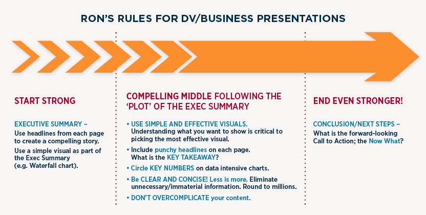
Monteiro recommends that presentations should be structured like a story. You have to start strong and grab your audience’s attention: why should they put their phones down and listen to you? Frame this as an executive summary, using the headlines from later slides will tightly unify the entire report. “A lot of times what I'll do is to use a very simple visual, such as a waterfall with a few bullet points — maybe the subheads from each section — to summarize the entire story,” said Monteiro.
The middle is the heart of the presentation. Simple and effective visuals are really important. What are you trying to show? Are you trying to show a comparison, a composition or a distribution variance?
Knowing that really helps you to pick the right visualization to use. You’ll also want to use punchy headlines, include key takeaways, and circle important numbers on data intensive charts, that way you’re directing your audience where you want them to go as opposed to them just kind of scanning the charts. Be clear and concise — less is more — and don’t overcomplicate your content.
“I've seen presentations where the visuals are so complicated that the presenter spends a lot of time explaining the visuals to the audience,” said Monteiro.
And you want to end strong: include a call to action. You've explained what’s going on, now what? What do you want your audience to do with this information? How is the business going to improve from here?
Advice for creating powerful dataviz

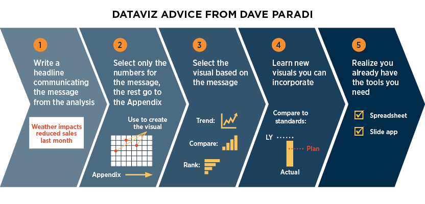
Dave’s advice zeroed in the specific visualizations themselves. First, write a headline that communicates the message of the analysis. What do you want the audience to know?
Next, only select the numbers you need for the visual. Everything else goes in the appendix. “’But they want to see everything!’ No, they don't,” said Paradi. “What they want is to know what they need to know in order to make the decisions to help your business reach its goals.”
Third, select a visual based on the message you are communicating. “This is the tricky part for a lot of business and finance professionals, so what I say is, pick it based on the message, not what looks pretty. It's not about [art]. It's about communicating the important messages from the analysis,” said Paradi. Fourth, make sure you know new and useful visuals that communicate effectively.
And lastly, relax knowing that you already have the tools you need. The basic tools of a spreadsheet and a slide app, and you can create compelling data visuals.
Read the room
How do you know if your visual communication is successful? Do more than dump your data and exit the room, invite questions in the moment and after the meeting. “If you walk away with more questions from folks than what you thought you would get after you presented the information, then maybe you need to go back and do some work,” said Miller.
If it's confusing, if your audience didn't pick up the key messaging that you were trying to provide, then that's a pretty clear indication that maybe your reports aren't reaching them, and you need to go back and see what improvements you can make.
Getting no questions can be just as bad — or worse. It can indicate the fact that no one understood your presentation. For some people, finance is a foreign language, and we to be cognizant of that fact.
Too much, enough, too little
How much information is too much? Too little? Just enough? “There are lots of ways to address that,” said Monteiro. One tactic is to speak to whomever in your audience will have the least amount of knowledge of finance. Make sure that individual can quickly grab the information as presented. You can always opt to supplement the presentation with an additional document for those with the most knowledge in the room, such as the CFO. It all comes down to understanding your total audience.
Another trick is to schedule a pre-meeting with various stakeholders to get some direct feedback and then make changes accordingly. For standard reporting such as performance reports and budget variance meetings, explain the reports and formats to audience to create familiarity.
Clarity is the goal. Your audience shouldn’t have to work to understand your presentation. Not only shouldn’t they have to, but they may well choose not to. And if they do, they may not come to the conclusion you desire.
If you’d like to see some data visualization makeovers, check out the full webinar here.
PARTNER CONTENT:
Copyright © 2024 Association for Financial Professionals, Inc.
All rights reserved.

![UMB Bank Vert Full Color CMYK[2] UMB Bank Vert Full Color CMYK[2]](/images/default-source/default-album/association_of_financial_professionals/umb-bank-vert-full-color-cmyk-2.png?sfvrsn=169a146b_1&MaxWidth=140&MaxHeight=140&ScaleUp=false&Quality=High&Method=ResizeFitToAreaArguments&Signature=27622428BC9C346FF684161B44C690104798350E)

.png?sfvrsn=2c6d166b_2&MaxWidth=80&MaxHeight=50&ScaleUp=false&Quality=High&Method=ResizeFitToAreaArguments&Signature=E38BCEACDE40B47D5C22BBB194B034137985F265)
