Articles
What’s Wrong With This Picture, FP&A Professionals?
- By Bryan Lapidus, FP&A
- Published: 11/13/2018
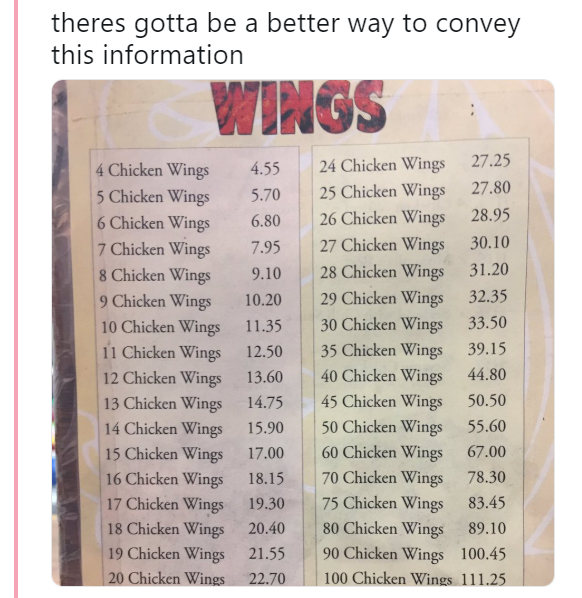
FP&A professionals pride themselves on presenting information in a clear and concise manner. So what’s wrong with this picture?
We in financial planning and analysis obsess over the best way to convey information in a clear, concise manner that supports good decisions. That is why this string of Tweets caught my eye—this menu for chicken wings accomplishes none of those goals!

Source: @seanposting/Twitter
Kidding aside, he continued: “I don’t know if anyone has noticed, but chicken wings #s 5, 7, 8, 10, 11, 13, 14, 16, 17, 19, and 20 are all more expensive than the first four wings. Why would they do that? And chicken wing #25, at $1.55, is a lot more—maybe it’s an extra-good one!”
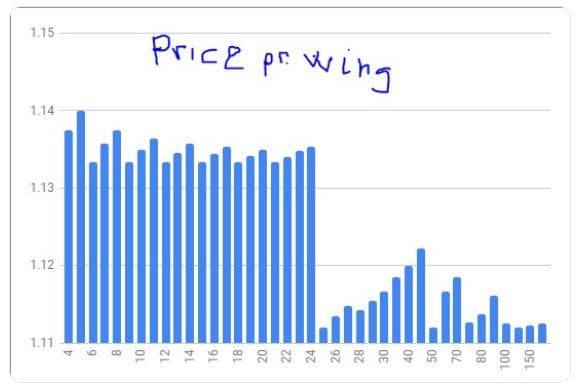
The Twitterverse seized on the topic and tried to make sense of it, through tables, formulas and analytics. Here is a graph of price per wing that explains the challenge:

Source: @btuftin/Twitter
How you display information matters—your customers who may be confused, angered, or just lose faith in your credibility. And it matters to your company effectiveness and making good decisions about cost and operations. I trust that their wings are better than their quantation!
Connect with Bryan Lapidus, FP&A, via email, LinkedIn or Twitter.
Copyright © 2024 Association for Financial Professionals, Inc.
All rights reserved.

