Articles
Curve Fitting and MAPE: How to Use Them Correctly
- By Bryan Lapidus, FP&A
- Published: 1/7/2019
Statistical tools are gaining in importance as the volume, variety, and velocity of data increases. But are we using the tools built into statistical software the right way? Do we fully understand their potential? Are we even using them at all? Here are two foundational concepts in statistics with direct application to FP&A: Fitting the curve and MAPE.
WHAT IS FITTING THE CURVE AND MAPE?
“Fitting a model” is the way of describing a data set through formulas, or, more formally, the act of creating a relationship between predictors (independent variables) and outcomes (dependent variables). We want the best fit for the historical data so that we apply that for predictive purposes (if we believe the future to look like the past) or evaluate similar events. Of the many existing models we can apply, the best fit will have the smallest variance from the actual data.
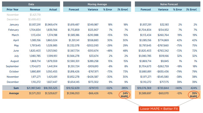
MAPE, or mean average percentage error, is a method used to calculate the average variance. When comparing the accuracy of various forecasting methods, the one with the lowest MAPE may have the best predictive power. The variance of each period, averaged, expressed as a percentage:
Statistical tools are gaining in importance as the volume, variety, and velocity of data increases. The tools built into software and the topic of discussion among our business partners. Are we using them? And are we using them the right way? Here are two foundational concepts in statistics with direct application to FP&A: Fitting the curve and MAPE.
WHAT IS A USE CASE FOR FITTING THE CURVE AND MAPE?
Here is an example:
The XYZ Company has a series of sales promotions throughout the year; the promotions are essentially the same as the prior year and the business is very stable. XYZ Co. had developed a series of very sophisticated forecasting techniques for each promotion based on promotion parameters and customer behavior, but they wanted to apply the historical data for predictive modeling.
XYZ Co. purchased a software package that would run more than 20 different analyses—time series, ARIMA, regressions, etc.—to see which one best fit the historical data and compare it to their proprietary model. The model with smallest historical MAPE was chosen as the best indicator of future outcomes and used for forecasting purposes, although the test for best fit was conducted periodically in case the data changed and a different curve became more appropriate.
In the example shown here, the prior year’s revenue is given as the basis for two forecasts, moving average and the naïve forecast. This generates a forecast that is compared against the actual data, creating a variance for each month. The MAPE compares the performance over a one-year period.
Learn more about the importance of fitting a curve, and how the MAPE can help you figure out which curve is the best fit, here.
Want to learn more about business statistics? Join your FP&A peers at FinNext 2019 to be part of the future of finance.
Copyright © 2024 Association for Financial Professionals, Inc.
All rights reserved.

