Articles
5 Ways to Visualize Data: Thanksgiving Edition
- By Joanne Oh
- Published: 11/18/2022
 While there is no one right way to visualize data, pairing a method that complements your message is key to effective delivery. As a fun exercise leading into Thanksgiving in the United States, we invited four data visualization experts to create charts related to the holiday and explain the choices they made in their visualization.
LINE CHARTS SHOW TRENDS BEST
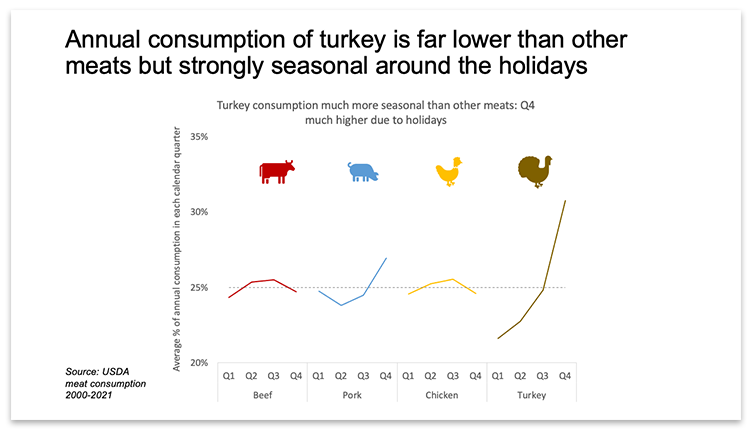
Example: Annual consumption of turkey is far lower than other meats but strongly seasonal around the holidays
Dave Paradi from ThinkOutsideTheSlide.com shared an example created in Excel and PowerPoint to demonstrate that people can create meaningful data visuals with the resources they likely already have.
He started with a clear headline so the viewer knows what the key message will be. He chose line charts as they are best at showing trends, especially when compared to column charts. The second chart showing seasonality is specifically a panel line chart as it makes it easier to see each trend. The 25% reference line on the seasonality chart allows the viewer to compare the trend to consistent consumption in each quarter. Finally, to increase visual appeal, he used icons in place of a legend.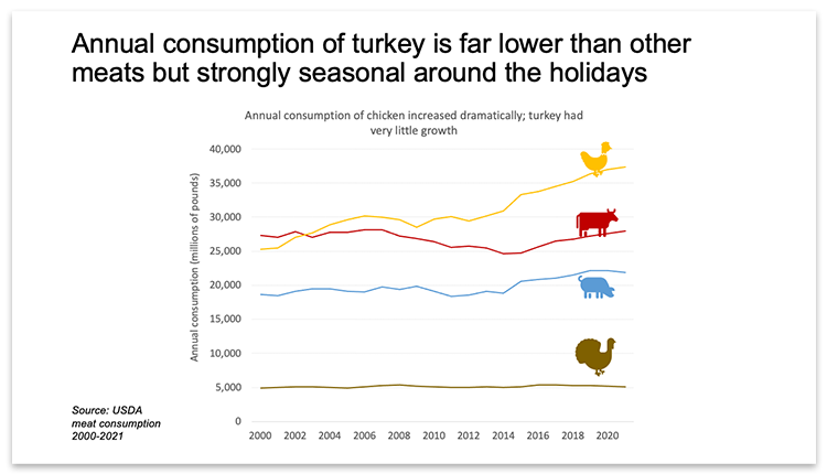
THE PIE CONTROVERSY: TO PIE …
Example: White to dark meat ratio in a turkey
The age-old data visualization debate: Are pie charts useful or not? Josh Aharonoff from Mighty Digits submitted an example in favor of the classic pie chart while providing more detail on a 15-pound turkey. He kept it graphically simple with two slices and corresponding percentages. To indicate to the viewer the size of the whole, he equated the pie chart to the 15-pound turkey.
Example: Americans who eat turkey on Thanksgiving
A variation of the classic pie chart is the donut chart. Aharonoff described it as “just a pie chart with only the crust” which allows you to fill in the center with an image or number. He also noted that there is a reason that smartwatches are filled with donut charts. His recommendation: Use donut charts to show ratios, ideally four or fewer. The example below shows a percentage out of 100.
… OR NOT TO PIE
Example: A pie chart turned into a clustered bar chart
Ron Monteiro from KICT had a more mixed evaluation of the pie chart. He shared an example (below) and broke down the pros and cons.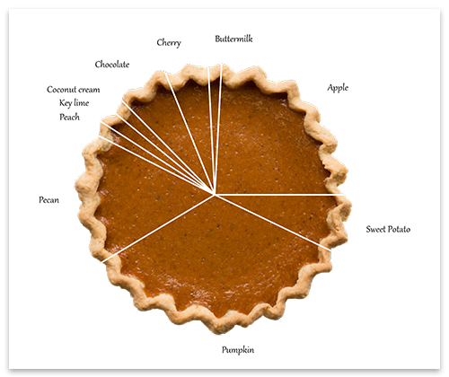
Source: Brinnae Bent, PhD, Towards Data Science
| Pros | Cons |
|---|---|
| Very easy to create | Looks simplistic with few segments |
| Visually appealing | Gets messy with too many segments (hard to interpret) |
| Shows scale | Hard to work out exact values |
| Can summarize large amounts of data | Does not tell you how large the whole is |
The alternative he proposed is the clustered bar chart. Below is the same data presented in a new format.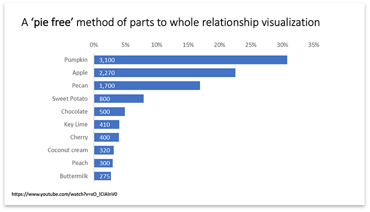
USE COLOR TO EMPHASIZE YOUR POINT
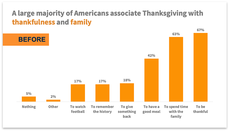
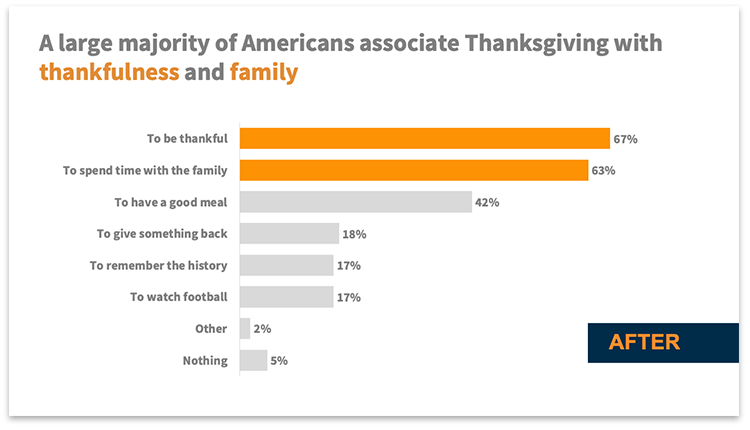
Example: A large majority of Americans associate Thanksgiving with thankfulness and family
Soufyan Hamid from SouFBP explained that it’s important to emphasize the points you want to communicate with your charts. A great way to do this is by using a pop of color on the key points while keeping the rest more muted.
In the example below, the “before” version uses the same color for all the bars. In the “after” version, most of the bars are gray and only the top two are orange. This highlights the insight as he tied it to his headline.
Bonus tip: When working with qualitative data with long text, horizontal bar charts can be used to great effect to prevent the text from getting scrunched up.
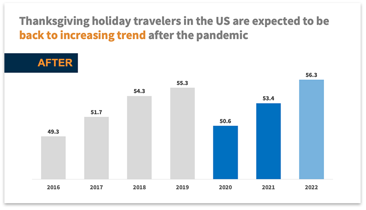
Example: Thanksgiving holiday travelers in the U.S. are expected to be back to increasing trend after the pandemic
Hamid took his use of color a step further in the “after” version of this next example. Because the data is focused on changes since the pandemic, he used the color blue to distinguish columns for 2020-2022 from pre-pandemic years. Since 2022 is also a forecast, he made this distinction visually clear by making only this column a light blue color, instead of the dark blue used for the others.
Bonus tip: Be careful not to overload your viewer with data just because you have it. The “after” version demonstrates the decision to edit out the years from 2008-2015; that data is factually correct but does not make the point clearer to the reader!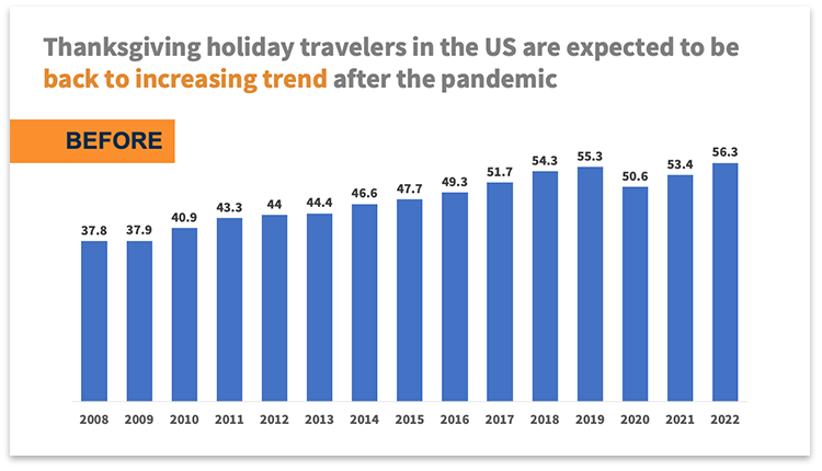
ICONS CAN CONVEY SCALE
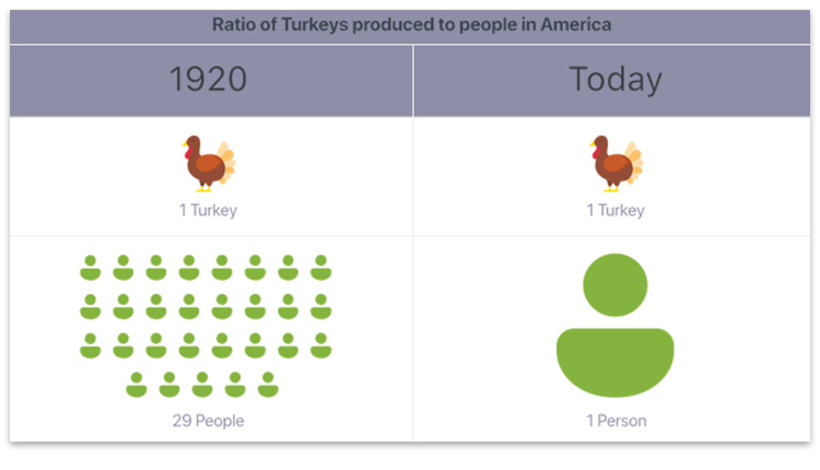
Example: Ratio of turkeys produced to people in America
Icons can be used to visually convey ratios or the scale of data. Aharonoff explained that while numbers are important, showing a visual that relates to the data can help users comprehend the information much more quickly.
In the example below, Aharonoff used the people icons for each number shown as a way to represent the ratio of turkeys produced to people in America, in 1920 and the present day. The people icons visually reinforce the drastic change in ratio.
Example: Turkey industry employment
In the next example below, Aharonoff used icons to imply a large number of people. Even without the icons being a literal translation of the number referred to in the data, they still provide greater context than without.
Looking for more tips on data visualization?
- Illuminating Best Practices for Effective and Compelling Data Visualizations
- Report Renovations: How to DIY an Effective Presentation
- Before and After Data Visualizations
AFP members can also watch recorded webinars, including “Data Visualization for Improved Communications” and “Visualization: Review and Critique of Performance Reporting.“
AFP would like to thank the data visualization specialists who contributed to this article: Dave Paradi, Josh Aharonoff, Ron Monteiro and Soufyan Hamid.
Copyright © 2024 Association for Financial Professionals, Inc.
All rights reserved.

